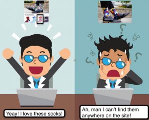
“What’s the most important thing I should do if I want to make sure my website is easy to use?” The answer is simple. It’s not “Nothing important should ever be more than two clicks away,” or “Speak the user’s language,” or even “Be consistent.” It’s…Don’t make me think!”
Steve Krug’s usability bestseller (2nd edition) was published in 2006, since then the world went “mobile first” with 197 billion mobile app downloads in 2017, Satoshi Nakamoto released their Bitcoin whitepaper, virtual assistants such as Siri and Alexa found ways into our everyday lives; however, it feels like we are still stuck in time when it comes to perceiving just under 2% Conversion Rate for eCommerce stores as the universal [and often unattainable] goal.
While in-store traffic converting at 15%–30%
Let’s see what’s happening here and what we can do about it.
Rob LoCascio in his post argues that there are two giant structural issues that make websites not work: HTML and Google:
– Consumers need a way to dynamically answer the questions that enable them to make purchases. In the current model, we’re forced to find and read a series of static pages to get answers — when we tend to buy more if we can build trust over a series of questions and answers instead.
– Offline, brands try to make their store experiences unique to differentiate themselves. Online, every website — from Gucci to the Gap — offers the same experience: a top nav, descriptive text, some pictures and a handful of other elements arranged similarly. Google’s rules have sucked the life out of unique online experiences. Of course, as e-commerce has suffered, Google has become more powerful, and it continues to disintermediate the consumer from the brand by imposing a terrible e-commerce experience.
So if we have what we have what can we do about it?
“Software should behave like a considerate human being” – Alan Cooper – UX legend, ‘Father of Visual Basic’ and the inventor of design personas.
Let’s go!
- Stay out of people’s way Don’t interrupt them unnecessarily, don’t set up obstacles for them to overcome, just pave the road for an easy ride. Your designs should have intentional and obvious paths, and should allow people to complete tasks quickly and freely.
Meaning: no newsletter signup on website entry – especially for new users and on mobile. Collect lead natively in your content or on exit intent.
- Mind Attention Ratio – the ratio of the number of things you can do on a given page, to the number of things you should do. You should only have a single goal (or you’re doing it wrong), and thus the Attention Ratio should be 1:1.
- Optimize for user device
- Manage Expectations.
- Be honest. “We’ll respond to your request within four hours” is much stronger than no statement at all. Placing this short statement either directly above or below your CTA will ease the anxiety at the perfect moment.
- Tap into human’s tribal nature. “There are way too many reviews for this product” – said NO ONE ever!
- Write product descriptions for humans!
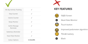
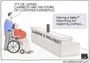
Want to add a caption to this image? Click the Settings icon.
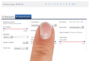
Providing preselected or predetermined options is one of the ways to minimize decisions and increase efficiency. But choose wisely: if you assign the defaults to the wrong options (meaning that the majority of people are forced to change the selection), you’ll end up creating more stress and processing time. E.g. match the default language with a language of the user browser not your assumption of the most commonly spoken language in that location.
- Avoid jargon. Explain what your products actually do for a customer. Not just copy-paste the factory label.
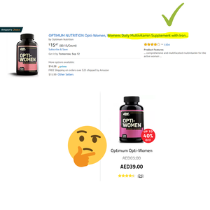
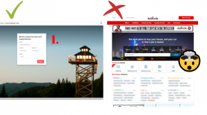
Want to add a caption to this image? Click the Settings icon.
- Optimize for site SPEED!
The stress levels of bad mobile experiences to watching a horror movie.
Lastly, remember:
“Trying to increase sales simply by driving more traffic to a website with a poor customer conversion rate is like trying to keep a leaky bucket full by adding more water instead of plugging the holes”. – Bryan Eisenberg, Call to Action